
Common Website Mistakes That Hurt Performance, Trust, and Conversions
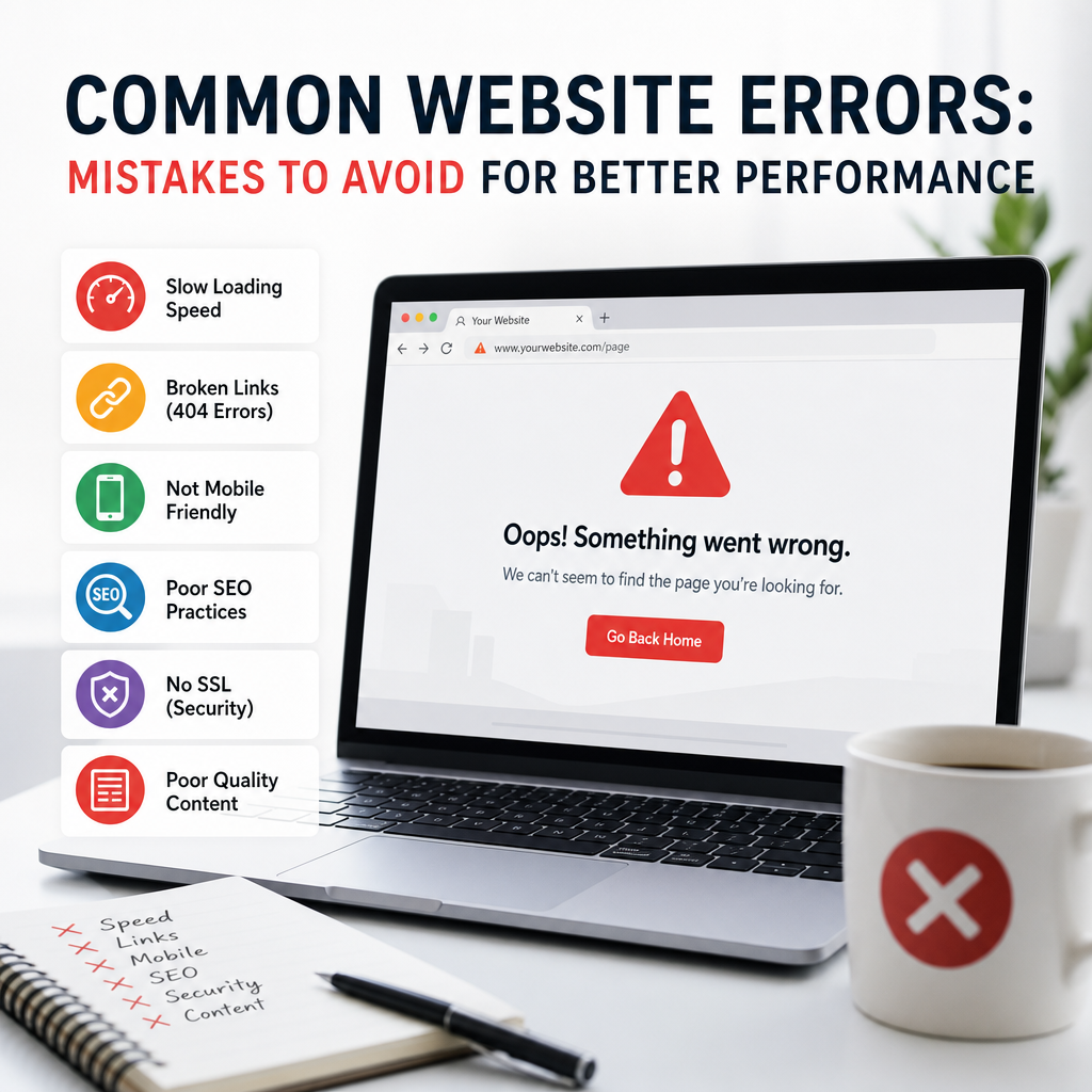
A website can be one of the most powerful tools for growing a business, building a personal brand, or generating leads. But even a visually appealing site can fail if it contains basic flaws that confuse visitors, weaken credibility, or slow down performance. Many of these issues are surprisingly common, and they often go unnoticed until traffic drops, bounce rates rise, or conversions stall.
The good news is that most website errors are fixable. By understanding the most common mistakes, you can improve user experience, strengthen search visibility, and make your site more effective overall. Below are some of the biggest website mistakes to avoid, along with practical examples and improvements you can make right away.
1. Slow Loading Speed
One of the most damaging website errors is a slow page load time. Visitors expect pages to load quickly, and even a short delay can cause them to leave before they see your content. Speed also affects search rankings, so slow websites can lose both users and organic traffic.
Why it happens
Common causes of slow speed include:
- Large, uncompressed images
- Too many plugins or scripts
- Poor-quality hosting
- Excessive animations or media files
- Unoptimized code
Example
Imagine a small online store with beautiful product photos that are all uploaded at full size. The images look great, but the homepage takes eight seconds to load on mobile. Many shoppers never wait that long, especially if they’re comparing multiple sites.
How to fix it
- Compress images before uploading them
- Use caching plugins
- Remove unnecessary plugins
- Choose reliable hosting
- Minify CSS and JavaScript files
- Use a content delivery network (CDN)
Even small improvements can make a noticeable difference in user satisfaction and conversion rates.
2. Confusing Navigation
If visitors cannot quickly find what they need, they are likely to leave. Poor navigation is one of the most frustrating website errors because it makes a website feel disorganized and difficult to use.
Signs of bad navigation
- Too many menu items
- Unclear labels
- Hidden important pages
- Inconsistent menu placement
- No search bar for larger sites
Example
A consulting firm might bury its pricing page three levels deep under vague menu labels like “Solutions” and “Resources.” A potential client looking for service details may give up and move on to a competitor with a clearer site structure.
How to fix it
Keep navigation simple and logical. Use labels that match what users are looking for, such as:
- Services
- Pricing
- About
- Blog
- Contact
For larger websites, add search functionality and breadcrumbs so users can move around easily. A clean menu helps both visitors and search engines understand the structure of your website.
3. Weak Mobile Experience
More people browse the web on phones than on desktops, yet many sites still suffer from mobile usability issues. A website that looks fine on a laptop but breaks on a phone creates a poor experience and increases bounce rates.
Common mobile problems
- Text too small to read
- Buttons too close together
- Layouts that don’t fit the screen
- Pop-ups that are hard to close
- Forms that are difficult to fill out
Example
A restaurant website may display beautifully on desktop, but on mobile the menu is hidden behind tiny icons and the reservation button is buried below the fold. A customer trying to book a table may abandon the site out of frustration.
How to fix it
- Use responsive design
- Test pages on multiple devices
- Make buttons large enough for tapping
- Keep forms short and simple
- Avoid intrusive pop-ups on small screens
Mobile usability is not optional anymore. If your site is not easy to use on a phone, you are losing opportunities every day.
4. Poorly Written or Thin Content
Content helps people understand your business, your offers, and why they should trust you. One of the most common website errors is publishing content that is too short, too vague, or not helpful enough.
What this looks like
- Homepage copy with generic claims like “We deliver quality”
- Service pages that don’t explain benefits or processes
- Blog posts that repeat the same points without depth
- Pages filled with keyword-heavy text that sounds unnatural
Example
A web design agency might have a services page that simply says, “We create websites for all industries.” That statement tells visitors almost nothing. It does not explain the agency’s process, expertise, or what makes it different.
How to fix it
Create content that answers real questions and provides useful details. Good website copy should:
- Explain what you do
- Show who you help
- Describe benefits clearly
- Address common objections
- Include proof, such as results or testimonials
Well-written content builds trust and helps visitors make decisions. It can also improve SEO when it is genuinely useful and relevant.
5. No Clear Call to Action
A website should guide visitors toward a goal. Without a clear call to action, people may browse for a while and then leave without taking the next step. This is one of those website errors that can quietly reduce leads and sales.
Examples of weak CTAs
- “Learn more” on every page
- No button above the fold
- Too many different actions competing for attention
- CTAs that are vague or generic
Example
An accounting firm might have an informational website with excellent blog content, but no prominent “Book a Consultation” button. Visitors read the advice, find it helpful, and then leave without ever contacting the firm.
How to fix it
Use specific, action-driven CTAs such as:
- Schedule a Free Consultation
- Get a Quote
- Download the Guide
- Shop the Collection
- Contact Us Today
Place CTAs strategically throughout your pages, especially near the top and after key sections. Make the next step obvious and easy.
6. Outdated Design
A website does not need to be flashy to be effective, but it should look current and professional. Outdated design can make a business appear inactive or less trustworthy, even if the company is excellent.
Common design issues
- Old-fashioned fonts
- Cluttered layouts
- Too many colors or visual effects
- Low-quality graphics
- Broken or inconsistent branding
Example
A law office might still use a site design from a decade ago, complete with small text, narrow columns, and a background texture that distracts from the content. Even if the firm is highly experienced, the site may give the impression that it has not kept up with modern standards.
How to fix it
- Use a clean, modern layout
- Choose a readable font
- Keep color choices consistent with your brand
- Use high-quality visuals
- Leave enough white space for breathing room
Good design should support the content, not compete with it. A modern site helps build trust before a visitor even reads the first sentence.
7. Ignoring SEO Basics
Search engine optimization does not guarantee rankings, but ignoring it completely makes it harder for people to find your site. Many website errors are tied to missed SEO fundamentals rather than advanced strategies.
Common SEO mistakes
- Missing title tags and meta descriptions
- Using duplicate page titles
- Not optimizing headings
- Forgetting alt text for images
- Broken internal links
- Poor URL structure
Example
A local service business might have several pages with titles like “Home” or “Services” instead of more descriptive titles such as “Plumbing Repairs in Denver” or “Emergency Drain Cleaning.” Search engines and users both benefit from clearer labeling.
How to fix it
Focus on the basics:
- Use one clear H1 per page
- Add descriptive title tags
- Write helpful meta descriptions
- Link related pages together
- Use keyword phrases naturally
- Optimize images with alt text
SEO should support usability, not replace it. When done well, it helps users and search engines understand your site more easily.
8. Too Many Pop-Ups and Distractions
Pop-ups can be useful for collecting emails or promoting offers, but too many of them become annoying fast. Visitors often leave when they feel pressured, interrupted, or overwhelmed.
Common distraction problems
- Multiple pop-ups appearing in the same visit
- Pop-ups that appear immediately
- Auto-playing videos with sound
- Animated banners covering content
- Too many competing offers
Example
An online magazine may greet visitors with a newsletter pop-up, a discount offer, a cookie notice, and a chat bubble all at once. Instead of engaging with the content, visitors are forced to close distractions before they can read anything.
How to fix it
Use pop-ups sparingly and strategically. Make sure they:
- Appear at the right time
- Offer real value
- Are easy to close
- Do not block important content on mobile
Less distraction often leads to better engagement. A cleaner experience usually works better than an aggressive one.
9. Missing Trust Signals
People are cautious when they visit a new website, especially if they are being asked to buy something, share personal information, or book a service. If your site lacks trust signals, visitors may hesitate to take action.
Important trust signals include
- Testimonials
- Reviews
- Client logos
- Certifications
- Case studies
- Secure payment indicators
- Clear contact information
Example
An ecommerce site with no visible return policy, no customer reviews, and no contact details may feel risky. Even if the products are great, the absence of trust-building elements can discourage purchases.
How to fix it
Place trust signals where visitors will notice them:
- On the homepage
- Near CTAs
- On product or service pages
- In the footer
- On checkout or contact pages
People want reassurance before they commit. Trust elements help them feel more confident about choosing you.
10. Broken Links and Technical Issues
Technical website errors can make a site feel neglected. Broken links, missing images, forms that do not submit, and error pages all create friction for users and can damage credibility.
Common technical problems
- 404 pages from deleted content
- Internal links pointing to wrong URLs
- Forms with broken submission logic
- Missing images or media files
- Plugin conflicts
Example
A blog article may link to a helpful resource, but the destination page has been removed. The visitor clicks the link expecting more information and instead lands on a dead page. That interruption breaks the flow and may cause them to lose confidence in the site.
How to fix it
- Run regular site audits
- Check links after redesigns or migrations
- Test forms frequently
- Monitor your website for crawl errors
- Set up redirects when pages change
Maintenance matters. A website should be treated as an ongoing asset, not a one-time project.
11. Lack of Accessibility Consideration
Accessibility is often overlooked, but it is essential for making websites usable by as many people as possible. It also improves the experience for users in general. Ignoring accessibility is one of the most preventable website errors.
Accessibility issues may include
- Low color contrast
- Missing alt text
- Inaccessible forms
- Keyboard navigation problems
- Headings used out of order
- Videos without captions
Example
If a button uses light gray text on a white background, many visitors may struggle to read it. Similarly, if a form field is not properly labeled, screen reader users may not know what information is required.
How to fix it
- Use strong color contrast
- Add alt text to meaningful images
- Label form fields clearly
- Structure content with headings properly
- Ensure the site can be navigated by keyboard
- Add captions or transcripts where needed
Accessible websites are more inclusive and often more usable for everyone.
12. Not Reviewing Analytics or User Behavior
Some site owners launch a website and never check how people actually use it. Without analytics, it is easy to miss patterns that reveal hidden website errors.
What to look for
- High bounce rates on certain pages
- Exit points in the funnel
- Pages with low engagement
- Forms with abandonment issues
- Traffic sources that do not convert
Example
A homepage may attract lots of visitors, but if analytics show that most of them leave after a few seconds, the problem may be unclear messaging, slow load times, or weak CTA placement. Without data, you are guessing.
How to fix it
Use analytics tools to study user behavior regularly. Look for pages that need improvement, test changes carefully, and compare results over time. Data helps you make decisions based on evidence instead of assumptions.
Conclusion
Most website errors are not dramatic on their own, but together they can seriously limit a site’s effectiveness. Slow speed, weak navigation, poor mobile usability, thin content, and missing trust signals all create friction that drives visitors away. The best websites are not just attractive; they are clear, fast, useful, and easy to trust.
By reviewing your site with these common mistakes in mind, you can identify areas for improvement and create a better experience for every visitor. Small fixes often lead to big gains in engagement, search visibility, and conversions.
