
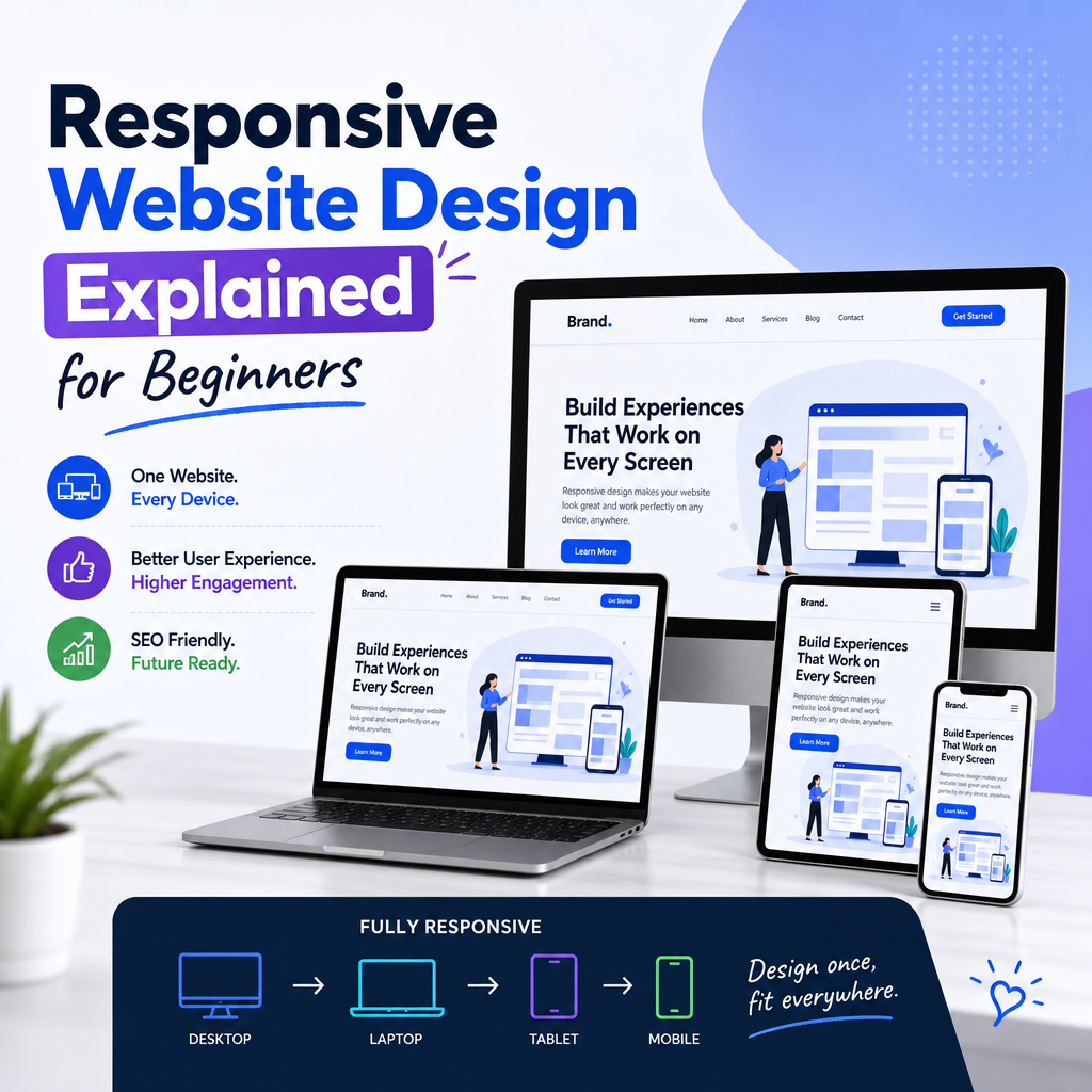
Responsive Web Design Explained
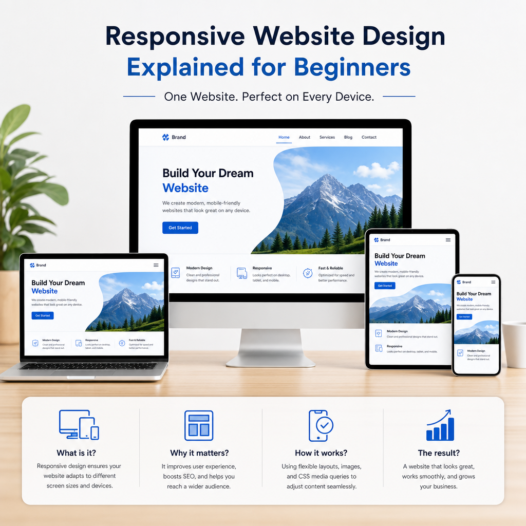
Today, people browse the web on phones, tablets, laptops, widescreen monitors, smart TVs, and even foldable devices. That creates a simple but important challenge: how do you make one website look and work well on all of them?
The answer is responsive web design.
A responsive website automatically adapts its layout, images, text, and navigation to fit different screen sizes and devices. Instead of building separate versions for mobile and desktop, responsive design lets one website respond fluidly to the user’s screen. It is now a standard approach in modern web development because it improves usability, accessibility, and overall user experience.
In this article, we’ll explain what responsive web design is, how it works, why it matters, and how businesses can use it effectively.
What Is Responsive Web Design?
Responsive web design is a design approach that allows a website to adjust dynamically to the screen it is viewed on. Rather than forcing users to zoom, scroll sideways, or struggle with tiny buttons, the layout changes to provide a better experience.
A responsive website typically uses:
- Flexible grids and layouts
- Scalable images and media
- CSS media queries
- Mobile-first design principles
The goal is simple: make content easy to read and use on any device.
For example, a three-column desktop layout may turn into a single-column layout on a phone. A large navigation menu may collapse into a hamburger menu. Images may shrink or reformat to fit smaller screens without breaking the layout.
Why Responsive Web Design Matters
Responsive design is not just a visual trend. It directly affects how people use your website and how search engines evaluate it.
Better User Experience
When a website is responsive, visitors can browse comfortably without pinching, zooming, or fighting with awkward navigation. This creates a smoother experience and reduces frustration.
A user who lands on an unresponsive mobile site may leave immediately if the text is too small or buttons are too close together. A responsive website makes it easy to stay engaged.
Improved Mobile Traffic Handling
Mobile usage continues to grow across industries. People search, shop, read, and contact businesses mostly from their phones. If your website is not responsive, you may lose a large portion of your audience.
Stronger SEO Performance
Search engines like Google favor mobile-friendly websites. Responsive design helps with SEO because:
- One URL serves all devices
- Content is easier for search engines to crawl and index
- Mobile usability improves ranking signals
- Duplicate content issues are reduced
A responsive website gives your pages a better chance of performing well in search results.
Easier Maintenance
Maintaining one responsive website is usually easier than managing separate desktop and mobile versions. Updates only need to be made once, which saves time and lowers the chance of inconsistencies.
How Responsive Web Design Works
Responsive design relies on a combination of technical tools that let the layout adapt to different conditions. The most important elements are flexible grids, media queries, and responsive media.
Flexible Grid Layouts
Traditional web designs often used fixed widths, such as 1200 pixels. That works on some screens but fails on others.
Responsive design uses fluid grids instead. Instead of specifying widths in fixed pixels, designers use relative units like percentages. This allows page elements to expand or contract based on the screen size.
For example:
- A sidebar might take up 30% of the screen
- Main content might take up 70%
- On smaller screens, those same elements may stack vertically
This flexibility keeps the layout usable across different devices.
CSS Media Queries
Media queries are one of the most important parts of responsive web design. They let developers apply different styles depending on the screen size, orientation, or resolution.
A media query might say:
- If the screen is smaller than 768px, use a single-column layout
- If the screen is wider than 1024px, display multiple columns
- If the device is in landscape mode, adjust spacing or navigation
This makes it possible to tailor the design to specific breakpoints without building a separate site.
Responsive Images and Media
Images and videos also need to adapt to the screen. Large images designed for desktop can slow down mobile performance or overflow the container if they are not scaled properly.
Responsive websites often use:
- Images that scale within their containers
- Different image sizes for different screen resolutions
- Modern formats for faster loading
- Video embeds that resize automatically
This helps maintain both design quality and performance.
Viewport Meta Tag
The viewport meta tag tells mobile browsers how to control the page’s dimensions and scaling. Without it, a mobile browser may render the site as if it were a desktop page and shrink everything to fit the screen.
A proper viewport setting helps ensure the responsive layout behaves as intended.
Mobile-First vs Desktop-First Design
When creating a responsive website, designers usually choose either a mobile-first or desktop-first strategy.
Mobile-First Design
Mobile-first design starts with the smallest screen and then adds more complex features for larger screens. This approach is popular because it focuses on essential content first.
Benefits include:
- Faster performance on mobile devices
- Cleaner, more focused design decisions
- Better support for growing mobile traffic
For example, a mobile-first site might begin with a simple header, a short call to action, and stacked content blocks. On tablets and desktops, extra features such as sidebars, hover effects, or more advanced navigation can be added.
Desktop-First Design
Desktop-first design starts with the full desktop layout and then adapts it for smaller screens. This approach was more common in older web design workflows.
While it can still work, it sometimes leads to cluttered mobile experiences because the design was originally built for a larger display.
In most modern projects, mobile-first is the preferred choice.
Common Components of a Responsive Website
Several design elements need special attention when building a responsive website.
Navigation
Navigation should be easy to use on both large and small screens. Desktop users may have enough room for a full horizontal menu, while mobile users often need a condensed version.
Common responsive navigation patterns include:
- Hamburger menus
- Collapsible menus
- Sticky navigation bars
- Simplified menu hierarchies
The key is to preserve usability without taking up too much space.
Typography
Text must remain readable at all screen sizes. That means font sizes, line spacing, and paragraph widths should adjust responsively.
Best practices include:
- Using scalable font units such as
remorem - Keeping line length readable
- Avoiding overly small text on mobile
- Maintaining strong contrast between text and background
A good responsive website never forces visitors to squint or zoom in just to read content.
Buttons and Forms
Interactive elements should be large enough to tap on small screens. Tiny buttons, close-together links, or cramped form fields can cause mistakes and frustration.
Responsive design improves these elements by:
- Increasing spacing between touch targets
- Making buttons large enough for fingers
- Ensuring forms stack vertically on narrow screens
- Keeping labels clear and visible
This is especially important for checkout pages, contact forms, and sign-up forms.
Layout Spacing
Spacing plays a big role in how a website feels on smaller screens. A desktop layout might have wide margins and multiple columns, but those same elements can feel crowded on mobile.
Responsive spacing adjusts padding and margins to keep the page readable and balanced.
Real-World Examples of Responsive Design
Responsive design is easiest to understand when you see how it works in practice.
Online Store Example
Imagine an e-commerce website selling shoes.
On desktop, the product page may show:
- Large product images
- Size options on the side
- Product description below
- Related products in a sidebar
On mobile, the same page might change to:
- One large image at the top
- Product details stacked vertically
- Size selectors placed directly below the image
- Related products shown at the bottom in a swipeable format
The content stays the same, but the layout becomes easier to use on a smaller screen.
Blog Example
A blog article on desktop may include:
- A wide header image
- Main content in the center
- Sidebar with recent posts or ads
On a phone, the sidebar may move below the article or disappear entirely, while the text expands to fit the screen width. This makes reading easier and keeps the article focused.
Business Website Example
A service-based company may use a responsive website to display:
- A hero section with a call to action
- Service cards in a row on desktop
- Stacked cards on mobile
- Click-to-call buttons for phone users
- A simplified contact form
This ensures visitors can quickly find information and take action regardless of device.
Benefits of Responsive Web Design
Responsive web design offers several practical advantages for both users and site owners.
1. Consistent Experience Across Devices
A responsive website delivers the same core content and branding on every screen. This consistency helps build trust and keeps the experience familiar.
2. Higher Engagement
When pages are easy to read and navigate, users are more likely to stay longer, explore more pages, and complete desired actions.
3. Lower Bounce Rates
If visitors can access content easily on their device, they are less likely to leave immediately. A better mobile experience often leads to better retention.
4. Cost Efficiency
Managing one website is often more cost-effective than maintaining separate desktop and mobile sites. Updates, content changes, and technical fixes are all simpler.
5. Future-Proofing
New device sizes and screen formats continue to emerge. Responsive design gives your website flexibility to adapt to future devices without major redesigns.
Challenges of Responsive Web Design
While responsive design offers many benefits, it also comes with challenges.
Performance Issues
If a website loads too many large assets, mobile users may experience slow performance. Responsive design must be paired with optimization, such as compressed images, efficient code, and careful asset loading.
Design Complexity
It can be difficult to make layouts look good across many screen sizes. Designers need to test how elements shift, stack, and resize in different conditions.
Content Prioritization
Not all content fits equally well on smaller screens. Responsive design often requires deciding what is most important and how to present it clearly.
Testing Across Devices
A responsive website should be tested on real devices and browsers whenever possible. Browser emulators are useful, but they do not always catch every issue.
Best Practices for Building a Responsive Website
If you want to create or improve a responsive website, these best practices can help.
- Design mobile-first when possible
- Use flexible layouts and relative units
- Test breakpoints at common screen widths
- Optimize images for speed and clarity
- Keep navigation simple and intuitive
- Make buttons and forms touch-friendly
- Use readable font sizes and spacing
- Check performance on slower mobile connections
- Test on multiple devices and browsers
A responsive design should feel natural, not forced. The layout should serve the content, not distract from it.
How to Tell If Your Website Is Responsive
You can quickly check whether your website is responsive by resizing your browser window or opening it on a phone or tablet. Ask these questions:
- Does the layout adjust without breaking?
- Is text easy to read without zooming?
- Are images scaling correctly?
- Is navigation still usable?
- Are buttons easy to tap?
- Does the page load reasonably fast on mobile?
If the answer is yes to most of these, your site is likely responsive. If not, it may be time for a redesign or optimization.
Conclusion
Responsive web design is essential in a world where users access websites from many different devices. A responsive website adapts to the screen size, delivers a better user experience, supports SEO, and simplifies maintenance.
By using flexible layouts, media queries, responsive images, and mobile-first thinking, you can create a site that looks polished and functions well everywhere. Whether you run a blog, an online store, or a business website, responsive design is one of the most important investments you can make for long-term success.
