
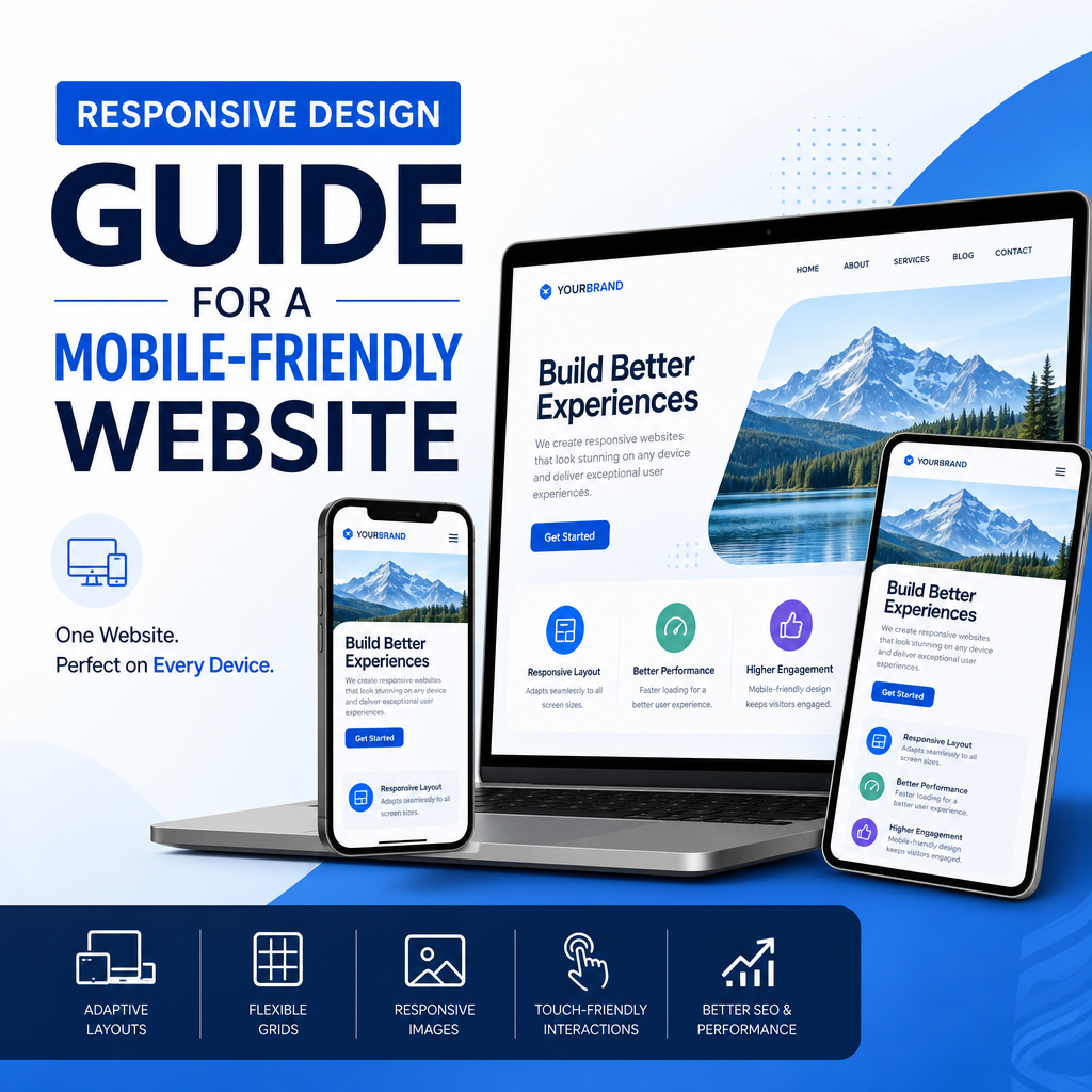
Mobile-Friendly Website Guide: Building a Better Experience for Every User
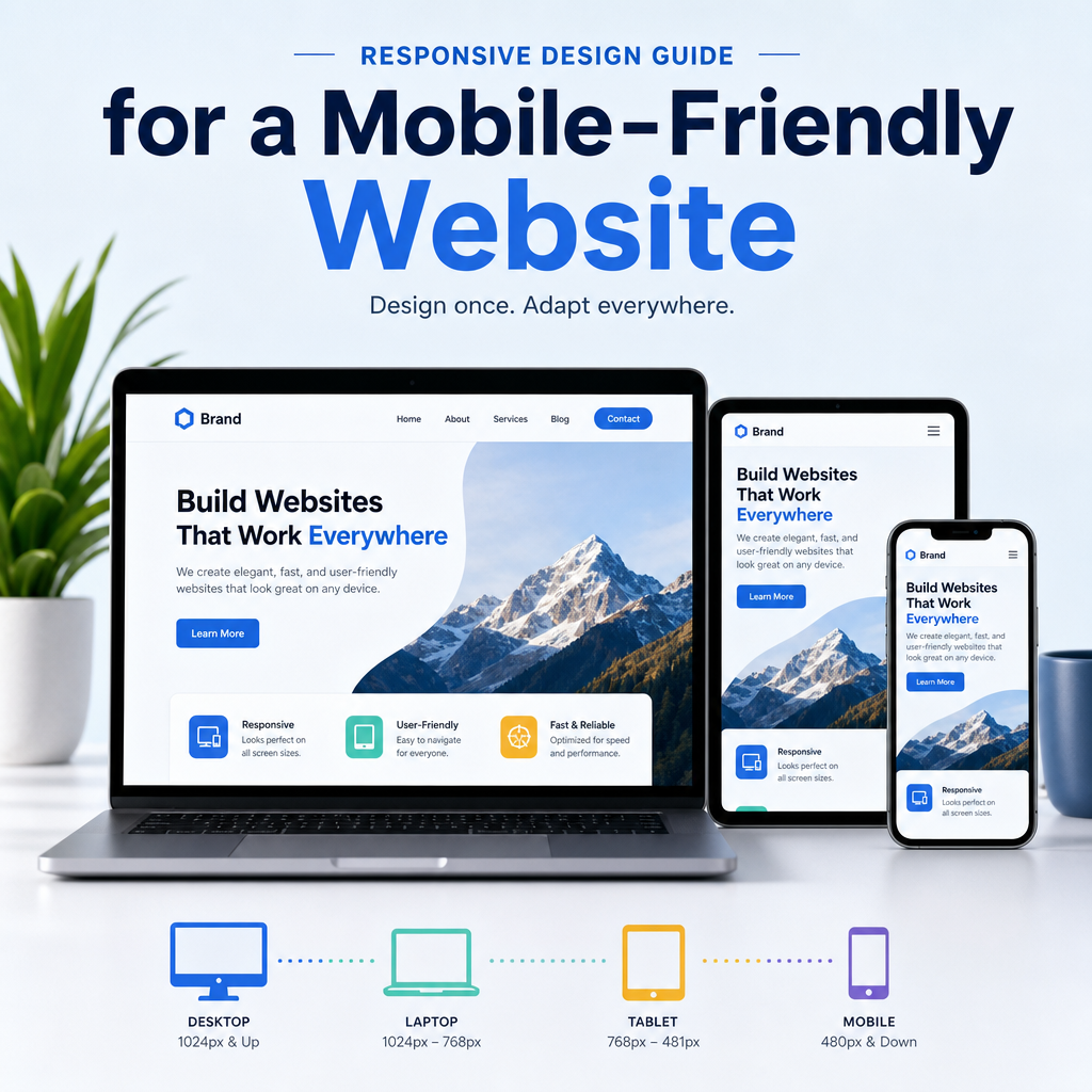
A mobile-friendly website is no longer a nice extra. It is an essential part of modern web design. People browse, shop, read, compare, and contact businesses from phones and tablets all day long. If your site is difficult to use on a small screen, visitors will leave quickly and may never come back.
One of the most important ideas behind a mobile-friendly website is responsive design. This approach allows a site to adapt to different screen sizes, making content easy to read and navigate whether someone is using a smartphone, tablet, laptop, or large desktop monitor.
In this guide, you will learn what makes a website mobile-friendly, why it matters, and how to improve your site for better performance and usability.
What Is a Mobile-Friendly Website?
A mobile-friendly website is designed to work well on small screens and touch devices. That means visitors do not need to pinch, zoom, or struggle with tiny buttons to use the site.
A truly mobile-friendly website usually includes:
- Easy-to-read text without zooming
- Buttons and links that are easy to tap
- Fast loading times on mobile networks
- Content that fits the screen width
- Simple navigation that works on touch devices
Mobile-friendliness is not just about appearance. It affects how people interact with your site and how search engines evaluate it.
Why Mobile-Friendliness Matters
Mobile traffic has grown dramatically over the years. For many websites, more visitors now come from mobile devices than from desktops. If your website is not optimized for these users, you risk losing traffic, leads, and sales.
Better User Experience
Visitors expect sites to load quickly and function smoothly on their phones. If your layout breaks on a smaller screen or content is hard to read, users may get frustrated and leave.
Higher Search Visibility
Search engines value mobile usability. A site that uses responsive design and provides a good mobile experience is more likely to perform well in search results than one that does not.
Improved Conversions
Whether your goal is getting inquiries, purchases, newsletter signups, or bookings, a mobile-friendly site can make the process easier. When forms are simple, buttons are clear, and pages load quickly, users are more likely to take action.
Stronger Brand Trust
A polished mobile experience shows that your business pays attention to detail. It signals professionalism and care, which helps build trust with potential customers.
Responsive Design Explained
Responsive design is the foundation of many mobile-friendly websites. It allows a single website to adjust automatically to different screen sizes and orientations. Instead of creating separate versions for desktop and mobile, responsive design uses flexible layouts, images, and CSS rules to adapt the same content across devices.
How Responsive Design Works
Responsive design typically relies on:
- Fluid grid layouts that use percentages rather than fixed widths
- Flexible images that resize within their containers
- Media queries that apply different styles based on screen size
- Scalable typography that remains readable on smaller screens
For example, a three-column desktop layout may shift into a single-column layout on a phone. A large image that looks great on a desktop may shrink automatically on mobile to prevent horizontal scrolling.
Why Responsive Design Is Preferred
There are several reasons responsive design is the preferred approach for modern websites:
- It offers a consistent experience across devices
- It is easier to maintain than multiple separate sites
- It helps avoid duplicate content issues
- It supports SEO best practices
- It adapts to new screen sizes and device types
For most businesses, responsive design is the smartest long-term solution.
Key Elements of a Mobile-Friendly Website
A mobile-friendly site is built from several important design and technical choices. Each one contributes to a smoother experience.
1. Readable Text
Text should be large enough to read without zooming. If users have to squint, they are more likely to leave.
Best practices include:
- Use a base font size that works well on mobile
- Keep line spacing comfortable
- Avoid long blocks of text without breaks
- Use headings and short paragraphs to improve scanning
A good mobile layout should make reading feel effortless.
2. Touch-Friendly Buttons and Links
On a phone, users tap with their fingers, not a mouse. Buttons and links should be large enough and spaced far enough apart to prevent accidental clicks.
Consider these tips:
- Make buttons easy to tap with one thumb
- Avoid placing clickable items too close together
- Use clear labels such as “Get a Quote” or “Book Now”
- Ensure menu items are easy to open and select
3. Fast Page Speed
Mobile users often browse on slower networks. Even a visually appealing site can fail if it takes too long to load.
To improve speed:
- Compress images
- Minimize unnecessary scripts
- Use caching
- Reduce oversized files
- Choose reliable hosting
Fast loading times improve both user satisfaction and search rankings.
4. Simple Navigation
Navigation should be easy to understand on a small screen. A cluttered menu can overwhelm users and make it hard to find information.
A good mobile navigation system often includes:
- A compact hamburger menu
- Clear section names
- Few top-level options
- Search functionality when needed
- A logical page structure
The goal is to help visitors get where they want to go with as few taps as possible.
5. Flexible Media
Images, videos, and other media should scale properly on different screens. If media is too wide, it can break the layout and force users to scroll sideways.
Use responsive media settings so assets resize automatically. Also, make sure video players and embedded content are optimized for mobile viewing.
Common Mobile Design Mistakes
Even websites that look good on desktop can fail on mobile if certain mistakes are overlooked. Here are some of the most common problems.
Tiny Text and Weak Contrast
Small fonts and low-contrast colors are difficult to read on small screens, especially outdoors or in bright light.
Pop-Ups That Block Content
Aggressive pop-ups can frustrate users on mobile devices. If a visitor cannot easily close a pop-up, they may leave immediately.
Oversized Images
Large, uncompressed images slow down pages and can distort layouts. Images should be optimized for web use and scaled properly.
Forms That Are Hard to Complete
Mobile forms should be short and simple. Too many fields, tiny input boxes, or unclear labels can discourage users from submitting them.
Horizontal Scrolling
If content spills off the screen, users may need to scroll sideways. That is a strong sign the design is not truly mobile-friendly.
Buttons Too Close Together
Tap targets should be separated enough to prevent accidental taps. This is especially important for navigation links and checkout buttons.
How to Test Your Website for Mobile-Friendliness
Testing is an important part of improving mobile usability. A site may look fine at first glance, but real-world testing often reveals problems.
Use Browser Device Emulation
Most modern browsers let you preview your site in different screen sizes. This helps you check layout, spacing, and navigation behavior.
Test on Real Devices
Nothing replaces testing on actual phones and tablets. Try different screen sizes, operating systems, and browsers to see how the site behaves.
Check Core Pages First
Start with the pages that matter most:
- Homepage
- Service or product pages
- Contact page
- Checkout or booking pages
- Blog posts or resource pages
These are often the pages that drive the most traffic and conversions.
Watch for Usability Issues
While testing, look for:
- Text that is too small
- Buttons that are hard to tap
- Menus that are confusing
- Content that overlaps
- Slow loading speeds
- Images or videos that break the layout
Use Mobile Testing Tools
There are many tools available to help evaluate mobile performance and usability. These can highlight technical issues, loading problems, and layout errors that may be easy to miss manually.
Best Practices for Mobile-Friendly Content
Design is only part of the equation. Content also needs to work well on mobile devices.
Write for Scanning
Mobile users often skim rather than read word for word. Structure your content so it is easy to scan quickly.
Use:
- Short paragraphs
- Clear headings
- Bullet points
- Bold text for important terms
- Simple language
Put the Most Important Information First
On mobile screens, users should not have to scroll endlessly to find essential details. Place key information near the top of the page.
For example, a service page might start with:
- A clear headline
- A short summary of the offer
- A strong call to action
- Important benefits or features
Keep Forms Short
Long forms can be frustrating on mobile. Only ask for the information you truly need.
For example, a contact form might only require:
- Name
- Email address
- Message
If you need more details, consider collecting them in a follow-up step.
Use Clear Calls to Action
A call to action should be easy to see and understand. Phrases like “Contact Us,” “Buy Now,” or “Schedule a Call” work well because they tell users exactly what will happen next.
Mobile SEO and User Experience
Mobile-friendly design and SEO go hand in hand. Search engines want to show users pages that perform well and provide a good experience.
Focus on Page Experience
Page speed, layout stability, and mobile usability all influence how users interact with your content. A site with strong mobile performance is more likely to keep visitors engaged.
Make Content Accessible
Search engines and users both benefit from accessible design. That includes proper heading structure, descriptive link text, and alt text for images.
Keep Important Content Visible
Avoid hiding essential text inside tabs or expandable areas unless it is truly necessary. Important information should be easy to find and index.
Use Structured Layouts
A clean content structure helps both people and search engines understand your pages. Use one H1 per page, logical H2 and H3 headings, and organized sections.
Real-World Examples of Mobile-Friendly Improvements
Here are a few simple examples of how mobile-friendly changes can make a big difference.
Example 1: A Restaurant Website
Before:
- Menu is hard to read on a phone
- Reservation button is buried in the footer
- Images load slowly
After:
- Menu uses a responsive layout
- “Book a Table” button appears at the top
- Images are compressed for speed
Result: More reservations from mobile visitors.
Example 2: A Local Service Business
Before:
- Contact form has 12 fields
- Phone number is not clickable
- Services page is cluttered
After:
- Short contact form with 4 fields
- Click-to-call button added
- Services are grouped into simple sections
Result: More calls and better lead generation.
Example 3: An Online Store
Before:
- Product photos break the layout
- Checkout form is difficult to complete
- Buttons are too small
After:
- Responsive product gallery
- Simplified checkout flow
- Large, touch-friendly buttons
Result: Fewer abandoned carts and higher sales.
How to Keep Your Site Mobile-Friendly Over Time
Mobile optimization is not a one-time task. Devices, browsers, and user expectations continue to change.
Review Analytics Regularly
Check how much of your traffic comes from mobile and which pages mobile users visit most often. This helps you prioritize improvements.
Re-Test After Updates
Whenever you change themes, plugins, page layouts, or content structures, test the mobile experience again. Small updates can sometimes create new problems.
Update Old Content
Older pages may not display well on modern devices. Refresh them with better formatting, improved images, and updated calls to action.
Monitor Speed and Performance
Over time, added scripts, plugins, or media files can slow down your site. Keep an eye on performance so your mobile experience stays fast.
Conclusion
A mobile-friendly website is essential for reaching modern users and creating a smooth online experience. With responsive design, you can build pages that adapt beautifully to different screen sizes while remaining readable, fast, and easy to use.
The best mobile websites combine strong design, simple navigation, optimized content, and ongoing testing. When visitors can quickly find what they need on any device, they are more likely to stay engaged, take action, and return in the future.
If your website is not yet fully mobile-friendly, start with the basics: improve readability, simplify navigation, optimize images, and make sure your layout uses responsive design. Small changes can create a big improvement in user experience and business results.
